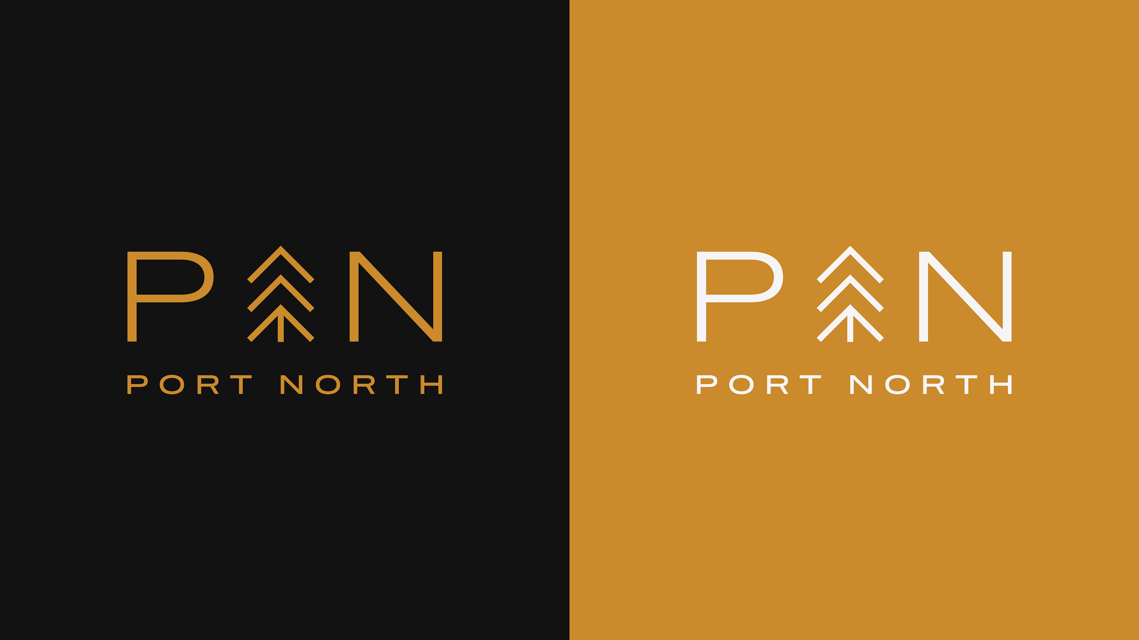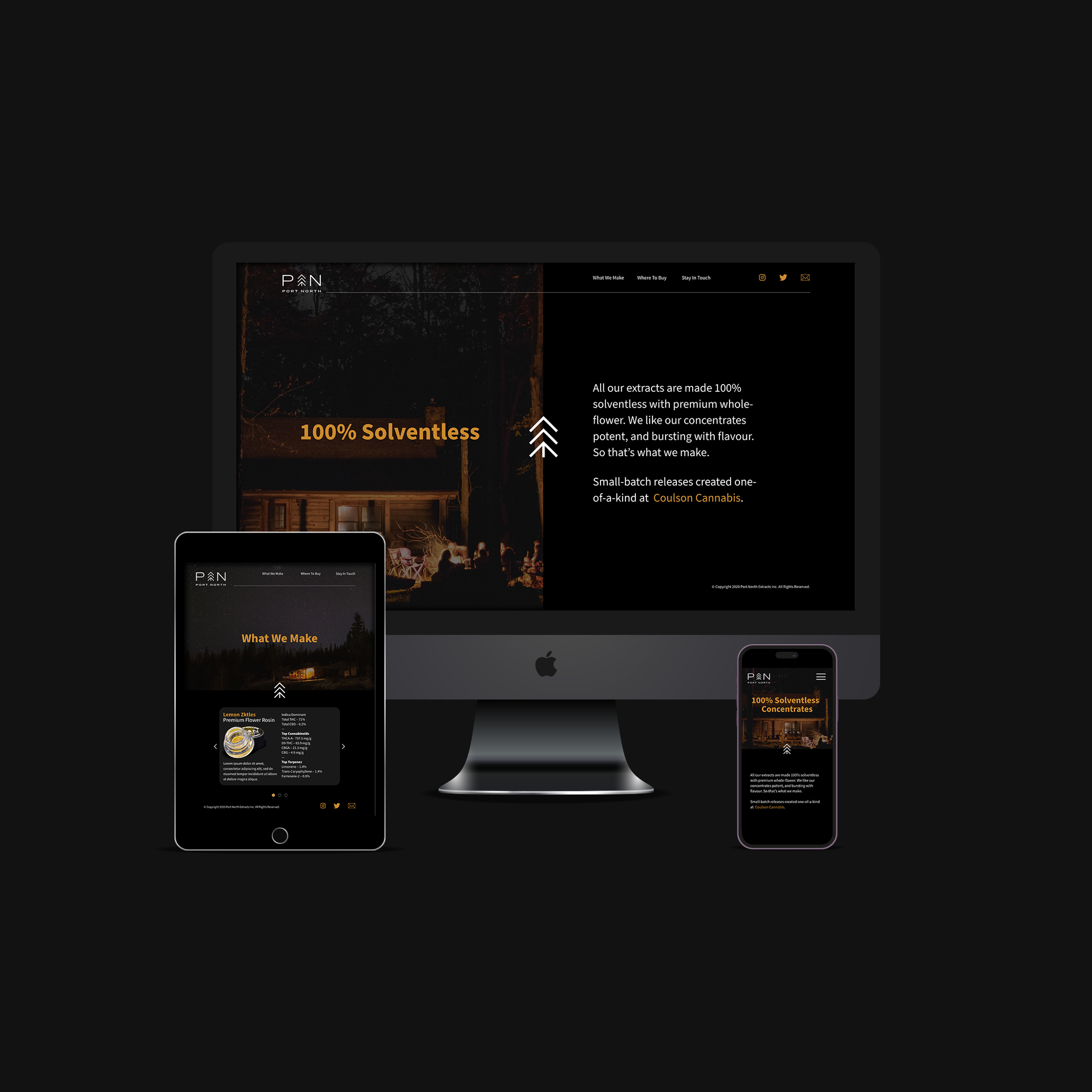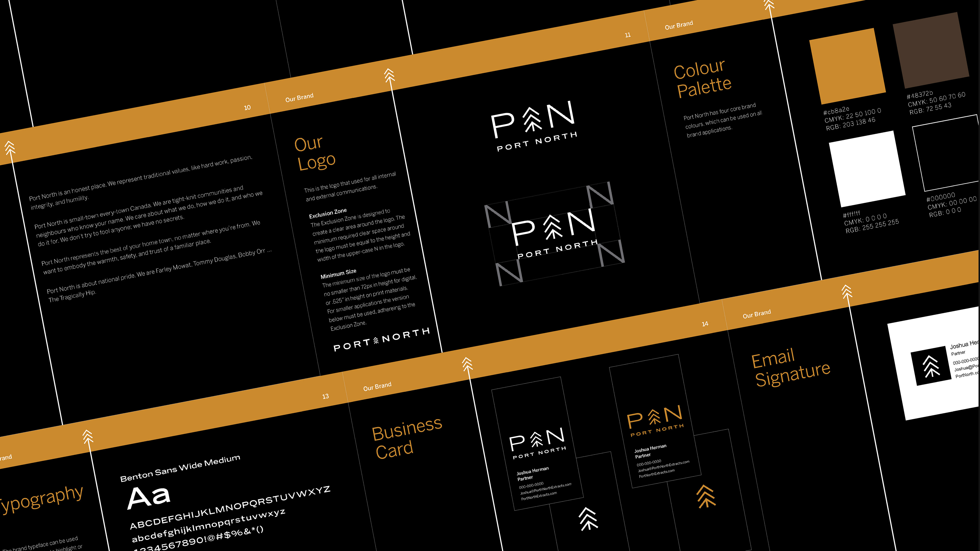
The Port North logo was designed as a direct, utilitarian mark with a strong sense of place.
The central symbol combines upward movement, northern reference, and evergreen-like geometry into a simple mark that can work with or without the wordmark. Paired with wide, deliberate typography, the identity feels confident, grounded, and straightforward — reflecting a premium solventless cannabis brand built on quality, transparency, and a no-gimmicks Canadian attitude.
The central symbol combines upward movement, northern reference, and evergreen-like geometry into a simple mark that can work with or without the wordmark. Paired with wide, deliberate typography, the identity feels confident, grounded, and straightforward — reflecting a premium solventless cannabis brand built on quality, transparency, and a no-gimmicks Canadian attitude.